Some changes introduced lately in Google Analytics tool user interface.
Change 1: Left Navigation
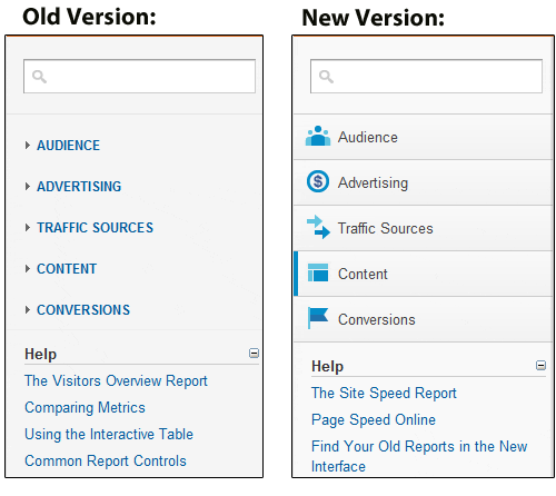
The left navigation has been updated. All of the categories within this are the same, but the layout is a little cleaner, and they’ve added icons:
Change 2: The Loading Bar
Whenever a report is loading, the bar appears, giving you an idea of how much longer you’ll have to wait.

Change 3: Top Navigation
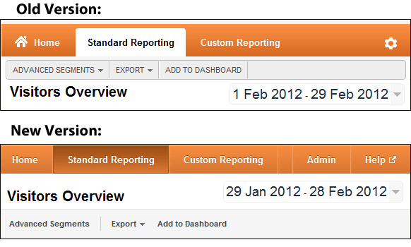
The top navigation has been significantly cleaned up, and they’ve reordered it so that the ‘date’ & ‘report title’ now sit above the ‘Advanced Segments | Export | Add to Dashboard’ navigation:
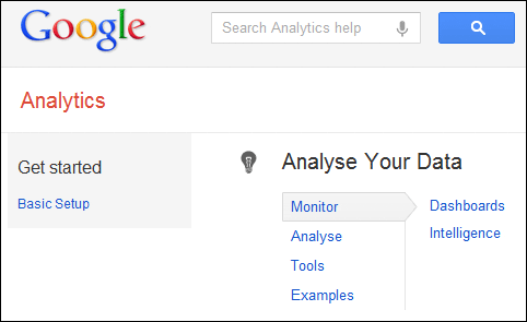
Opening up ‘Help’ takes you to a useful wizard type system that’s both organised by topic, and allows you to search:
Change 4: Graphing Options
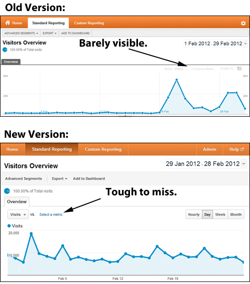
Previously, the ‘graphing options’ were barely visible, and I’m sure many people missed them. This is useful, as graphing and comparing different metrics is a key analysis tool. You’ll also notice they’ve highlighted the ‘Hourly / Day / Week / Month’ options as buttons, rather than making you click a dropdown before selecting them.
Change 5: ‘Fast Access’ Precision
One of the gripes of Google Analytics is that often you’re given a report in ‘fast access’ mode, meaning the data is limited to only a portion of the visits you actually want to see data for.
When this now happens, you’re given the option of ‘faster processing’ or ‘higher precision’. If you choose ‘high precision’, you get all of the data you’re looking for:
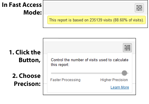
The option appears on the top-right, and appears most when you’ve applied ‘advanced segments’ to reports.
Change 6: Shared Dashboards
There is now a ‘share dashboard’ link in the top navigation when in the dashboards area:
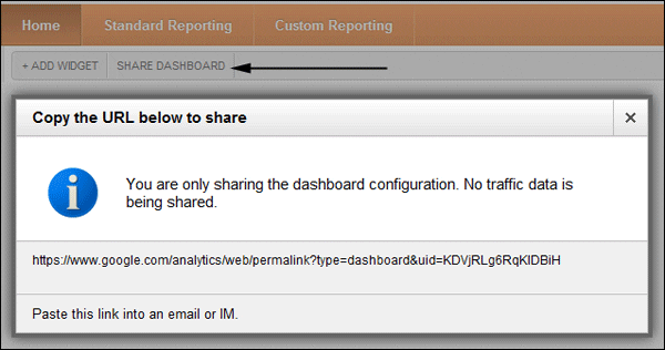
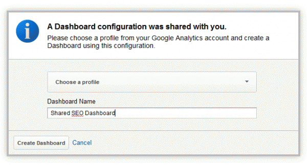
Paste the URL into any browser, and it allows you to choose which account/profile to add the dashboard to:
Change 7: Cached Reports
Previously, if a particular report took 30 seconds to load, and you visited it twice, it would take 30 seconds to appear both times you visited that report.
Now, after a report has been loaded once, it is saved in memory, so that the second time you visit it, it loads instantly.
To give a little control over this (in case you want to refresh the data), every report now tells you when it was loaded, and gives you the option to refresh the data.
![]()
Change 8: General Cleaning
There are lots and lots of minor user interface tweaks, including:
Graphs now appear a little cleaner, especially over longer periods:

Topline numbers associated with any report have been tweaked in terms of look:

Tool tips now appear when you move the mouse over certain elements:

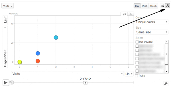
Bubble charts have been surfaced in more of an obvious way:


0 comments:
Post a Comment